
In life, we don’t tend to notice the mediocre or the average; rather, we notice extremes. We never think about the weather on an average day, but we always take note when it’s very hot or very cold, very dry or very wet, etc. In medicine, we don’t care too much about patients who have average or predictable outcomes; rather, we focus on those patients who seem to do miraculously well or who have poor outcomes that we would like to avoid. Our intuition teaches us that there is something to be learned in those patients who have outcomes that are at one extreme or another. Being intuitive beings, we ask questions. Why did the patient with the great outcome have such a good outcome? Why did the patient with the bad outcome have a bad outcome? Our intellects always seek to supply these answers so that we can learn from these experiences. We want to distinguish the extremes from the average.
These types of observations are the basis of anecdotal medicine. For many physicians, these types of experiences are powerful evidence that dictate future practice. If the bad outcome was observed, and it was accounted to a particular cause or intervention, that physician may decide to carefully avoid that intervention for the rest of his career. For example, a surgeon might experience a postoperative bleed after administration of ketorolac; he then avoids using the drug in his patients in the future and dogmatically evangelizes against the medication. He also notices that his problem with hemorrhage does not return and this serves as evidence that ketorolac increases the risk of postoperative hemorrhage and convinces him all the more of the correctness of his actions in blaming the ketorolac for any prior problems he had with bleeding. This type of anecdotal evidence often leads to the publication of case reports. Ketorolac, by the way, does not increase the risk of posteroperative bleeding.
When a series of good outcomes or bad outcomes occur, our ideas of cause and effect become reinforced. The surgeon in the previous example might have noticed that he had a series of hemorrhages early in his career and that these hemorrhages went away when he stopped using ketorolac; it is easier to blame the medication than it is to introspectively acknowledge that other factors might have reduced his personal risk of hemorrhage, including better technique or patient selection. A series of negative outcomes in particular might encourage a change or a new intervention in clinical practice; when that change is made, if the negative outcome is reduced or improved, this is often accepted as hard evidence of success and the need for the intervention. This accumulation of anecdotal evidence often leads to the publication of a case series.
In March 2017, a study published from Eastern Virginia Medical School stole headlines around the world for claiming that Vitamin C infusions were the miracle cure for patients with sepsis. Many notable physicians immediately called for Vitamin C to be used routinely in the treatment of patients with sepsis due to the amazing outcomes reported in Chest by Paul Marik. Marik reported that of 47 successive patients with sepsis to whom he administered Vitamin C, only four died. He compared this to the previous 47 patients treated at the same hospital for sepsis, and 19 of those patients had died prior to the change. With such a dramatic change, many began calling for immediate implementation of Vitamin C into the treatment algorithm for sepsis. Some pointed out that he had not just added Vitamin C but had also added thiamine and a corticosteroid, meaning that there was uncertainty about which of the three actually made a difference. Most in that group just called for adding all three.
But there is a bigger, more fundamental problem with Marik’s observation: regression to the mean. In fact, regression to the mean is one of the fundamental problems with anecdotal medicine in general.
The concept of regression to the mean is simple: over time, extremes will average out and return to the expected mean. If a group of students answer questions on a true or false test randomly, the average student will make a 50; but, out of a group of students, there will be some high scores and some low scores. In other words, we expect the average to be 50 but we also expect some deviation around this number if the choices are truly random. If the students are sorted from highest grade to the lowest grade and then the top and bottom 10% of students are given the same test again, then we would expect the test scores of those individual students to be closer to the mean. In other words, the top performing students will probably mostly perform more poorly (closer to a score of 50), and the bottom performing students will probably mostly perform better (again, closer to a score of 50). This is true because their original scores were based on luck or probability, not on talent or intelligence.

Look at the above graph. The red line represents any random distribution of data, whether it be students randomly answering questions on a test or a collection of labs or blood pressures from a population. Taken together as a data set, we understand that the data points in A and B represent the extremes of random data. It’s only when we focus on A and B that we begin to believe that they are meaningfully different. If A represents the group of students who tended to score well on the exam, the next time they take the test their scores will move towards the middle. Same for B. Again, this assumes that the answers are given randomly. Even with random answers, the next time the test is administered, there will still be some student in Group A who scores the highest score and some student in Group B who scores the lowest. Does this mean that they are really the smartest and dumbest kids? No. It was random. We need more information than just that to decide who the bright and dull kids are.
This concept explains a lot of poorly understood and nonintuitive phenomena. For example, the sophomore slump in sports. If a rookie has an outstanding performance in his first year, you can expect that his performance will go down the next year – and most of the time it does. Because the performance was so outstanding, there was probably a bit of good luck in the outcomes. Don’t be surprised when he does more poorly in the next season, meaning that he begins to return to his true performance mean. His average performance may still be better than that of most players (his great season was likely due to skill and luck), but it likely will not be as good as the outstanding performance in his rookie year which was aided by some balls bouncing the right way and other improbable elements.
The point is, in any large collection of random (and therefore not meaningfully different data), there will naturally be extremes. Not everyone has the exact same course when they catch a cold or have a surgery, for example. We must be careful not to see causes for randomness when none exists. Look at the graph below.
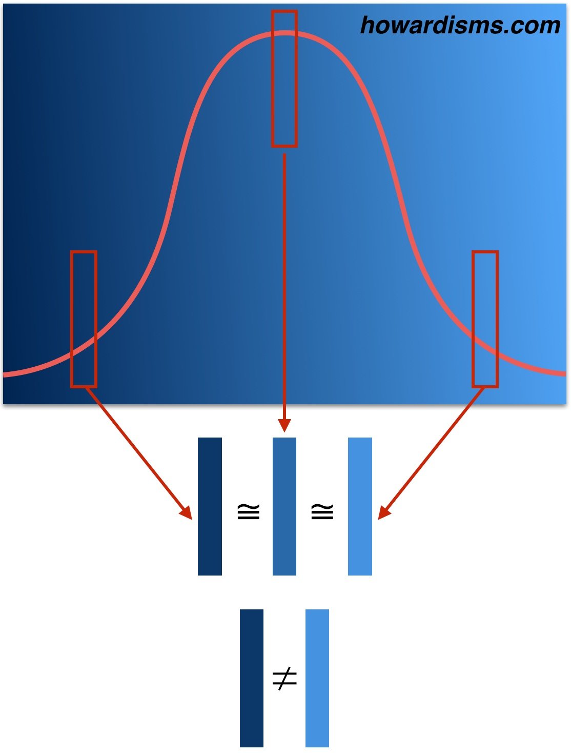
The graph shows different shades of the same blue. When a sample from the left tail is compared to the median, there isn’t a significant difference. Similarly, when a sample from the right tail is compared to the median, we are more likely to admit that the blues belong to the same set. But when we compare the two samples from the tails to each other (rather than the median), then the difference becomes more dramatic and we are more likely to see significance that may not exist.
If you have a bad year in the ICU, and 19 of 47 patients with sepsis die (left side of the graph), your next year is likely going to be better – maybe even significantly better, as your sepsis related mortality rate returns to the mean. It may even be the case that your next year is improbably good, with only four of 47 patients dying of sepsis (right side of the graph), and while this change seems like it must be significant, it may be related to chance alone (or to other factors like less morbid patients or maybe that corticosteroid that you gave). The two years vary not from each other but from the mean in different directions. This means that something that looks statistically significant may look that way because the comparator is incorrect. In other words, one year might be statistically different compared to another year, while neither year may statistically differ from the mean.
This simple principle explains why most anecdotal observations (and even most systematic studies) are wrong.
Think about how most anecdotes start: with an observation of an unusual finding (an extremely good or bad outcome), then an attempt to explain it. The extreme finding is likely due to chance alone, but even if it is not, the thought-of explanation is usually wrong and its seemingly cause-and-effect association is misleading (association does not equal causation). There are thousands of variables to account for in any given observed phenomenon.
An anecdote is one data point. In the literature it is called a case report. In the clinic, it starts with a the doctor saying, “This one time I had a patient who …” If you have several data points, this is a case series. A case series is a collection of unusual cases but there are still way too many variables to assume that the one variable you are interested in is the one (or the only one) that matters. The Vitamin C report is a case series. It is uncontrolled. In addition to the interventions that the authors focus on (Vitamin C, steroid, and thiamine) there may be an unlimited number or other differences (different nurses, different strains of flu, less legionella in the air condition system, fewer smokers, more flu shots, less resistant strains of bacteria, more attentive nurses after suffering through a year where almost everyone died, more hand washing, etc.).
A lot of data points may suffer from the same problems. A retrospective study is just a big and fancy case series. Just because there are two big swaths of data doesn’t mean that they don’t come from two extremes of the same larger, random data set.
This is where the randomized, blinded, placebo-controlled trial enters in. It is, unfortunately, our best way to control for known and unknown variables and to attempt to eliminate regression to the mean as a source of perceived difference. It’s not perfect, but that’s a conversation for a different time.
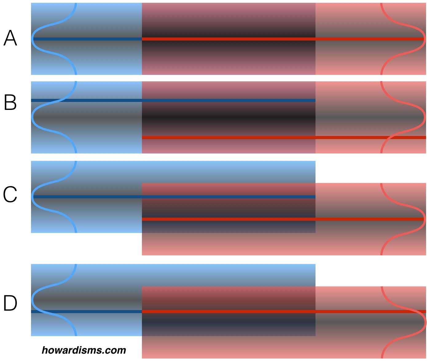
Look at the four examples above. Imagine that we are comparing two data sets to one another to look for statistical differences (blue and red). The dark blue and red lines represent the mean of our observed, experimental data sets. We don’t know how our data sets comport with the real data sets (represented by the bell-shaped curves at the ends).
In example A, our experimental data sets (the lines) match the median of the the actual data sets (the curves); what’s more, the data sets match each other, meaning that there is no statistical difference between the two and this observation is authentic. This is a true negative. In example B, the two actual data sets still match each other, but our experimental data sets were taken from different extremes of those data sets and appear different statistically. This is a false positive finding.
In example C, we have once again captured data sets that represent the real data sets. In this case, the data sets are statistically different. This is a true positive. However, in example D, the data sets appear the same because our experimental data sets were taken from the tails of the curve. This is a false negative.
These four examples don’t represent all the possibilities. For example, imagine if in example C the experimental data sets were taken from opposing tails. We would still identify a true positive, but the magnitude of effect would be greatly exaggerated.
In a perfect experiment, with perfect controls and perfect matching, false positives (example B) happen 5% of the time and false negatives (example D) happen 10-20% of the time. But the world of experimental science is far from perfect.
Anecdotal evidence, of course, is even worse and is dominated by regression to the mean. The average state for most people is absence of disease, so regression from disease to no disease is common with self-limited illnesses. Not all diseases are self-limited. Many are progressive without effective intervention. There are no Type 1 diabetics alive today because of alternative medical interventions. But the common cold has been cured by just about everything from Vitamin C to zinc. This is due to the natural course of the untreated diseases. If type 1 diabetes goes untreated (by insulin), death is inevitable; therefore, only insulin therapy appears to work (either anecdotally or by systematic analysis). Conversely, most disease states like the common cold resolve (or at least get better) on their own; therefore, any number of interventions (Vitamin C, homeopathy, Z-packs, essential oils, etc.) will cause it to improve since the condition will regress back to the mean.
There’s a lot of money to be made in treating diseases that get better on their own. Do you feel bad? Take my magic elixir and most of you who have self-limited illnesses will feel better. The key is learning which diseases are self-limited.
In palliative care, there is a concept called illness trajectory. Illness trajectories can be used to illustrate how chronic illnesses will eventually play out and then understand how interventions might change that trajectory.

The red line shows a healthy person who dies suddenly. To change the course of this death would require prevention of the proximate cause, like seat-belts for car accidents or depression screening and treatment for prevention of suicide. The green line represents a self-limited disease, like the common cold. A cold lasts just a few days. By the time patients seek treatment (at the red dot) when the symptoms are at the worst, there is usually just a few days of symptoms left. Any intervention started would seem to work unless the illness trajectory is carefully compared to a placebo-controlled disease trajectory. Dozens of products exist to treat the common cold. None have solid evidence that they change the illness trajectory but patients swear by them because of their own anecdotal experiences (think Vitamin C, which has been tested in nearly 30 randomized trials and found to be ineffective for treatment of the common cold). Physicians will prescribe an antibiotic at the same point and patients will pay to come and be mistreated in this manner (most commonly a Z-pack, which is dosed and indicated for treatment of community acquired pneumonia).
The yellow line represents a typical chronic disease. There are ups and downs of chronic diseases that may be random, may be related to an intervention, or may be related to less obvious things. For example, a newly diagnosed diabetic may be motivated to eat well and exercise; after a period of time, she may become depressed and her diabetes suffers because less attention is paid to diet and exercise. Eventually, the depression subsides and the condition improves. Lots of extrinsic and intrinsic factors may affect the course of the disease. If it is an insulin-dependent diabetes, then without insulin, she will die. The dotted yellow line shows a disease trajectory for type 1 diabetes without insulin. When we compare this disease trajectory to the one of diabetes with insulin, clearly insulin is an effective intervention.
The next intervention for diabetes did precede an improvement in the course of the disease but did not change the disease trajectory. Anecdotally, this new intervention seems to work well, but hopefully a large systematic study would show that it is no better than placebo. Imagine that a diabetic is doing poorly and buys some chromium off of a website. The hope that this miracle will make a difference gives the diabetic new optimism and the disease actually does improve – either by chance or because of a change in hopefulness. Either way, this is the placebo effect: simply a regression to the mean.
The whole field of alternative medicine and non-evidence based medicine is largely based upon people’s inability to recognize regression to the mean. Desperate people seek any treatment when they are at their worst. If they have a self-limited disease, any treatment will probably work. Even if they have a chronic disease, they will probably notice some period of improvement.
This fallacy is related to the Clustering Illusion, which we’ll talk about later. Unfortunately, most published scientific studies that focus on the association between two variables are also flawed by this concept. Always remember, 80% of medical studies published this year are wrong and will eventually be reversed. This week, for example, it was Vitamin D and Calcium for bone health. Wonder what it will be next week?